Skin RX is a face and body wellness clinic that aims to provide the best quality care and service at an affordable price. For our final project, we were grouped to create a responsive website for a real-time client. Aside from designing and developing the website, I also designed the banner ads and redesigned the logo.
SKILLS
UX Design
Wireframing
Design Systems
Logo & Branding
PROJECT TYPE
Web Design
Web Development
Business Website
DURATION
Sept 2018 – Dec 2018
TOOLS USED
Adobe Dreamweaver
Adobe Illustrator
Adobe Photoshop
Canva
Figma
PROJECT TEAM
Kenneth Sta. Cruz
Kaitlyn Pedralvez
Kathrina Tacastacas
ABOUT THE PROJECT
MINTER3 (Interactive Applications for Online Media 1) lays the foundation for developing websites using industry standards for development and ease of editing content. For our final project, we were grouped to create a responsive website for a real-time client using HTML and CSS. Our group leader, Kaitlyn, chose ‘Skin RX’ since it is their family business. Each member of the group made their own version of the website but we used the same colour, branding, and typography.
OBJECTIVES
- To inform the user of the different services and products the business offers.
- To establish the business branding clearly and efficiently.
- To maximize the website’s capabilities towards increasing business productivity.
VISUALIZATION
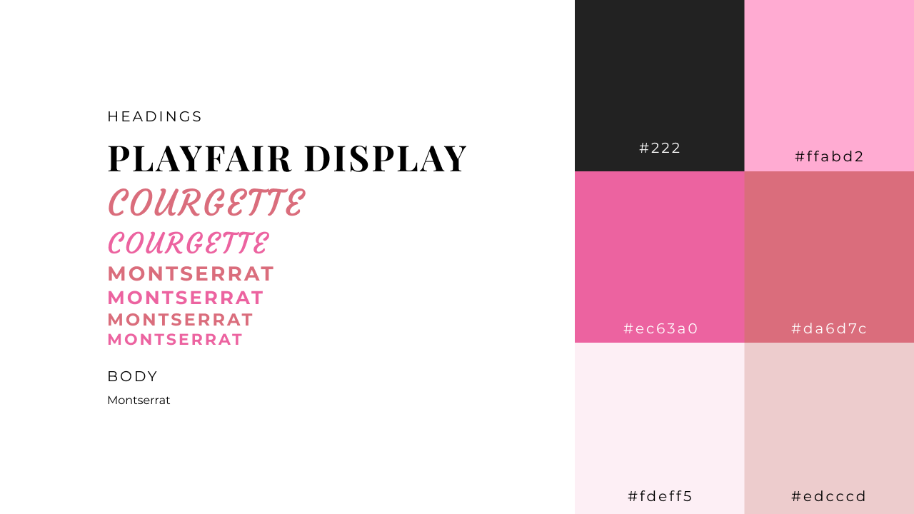
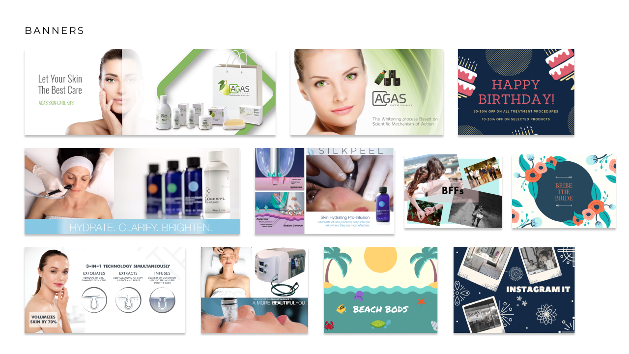
For my interpretation, I used different shades of pink to achieve a clean and relaxing look. I also designed all the banner ads found on the website. By combining the images I found on the Internet, I was able to create these product banners. For the promo banners, I designed them by reading their respective descriptions.
LOGO REDESIGN
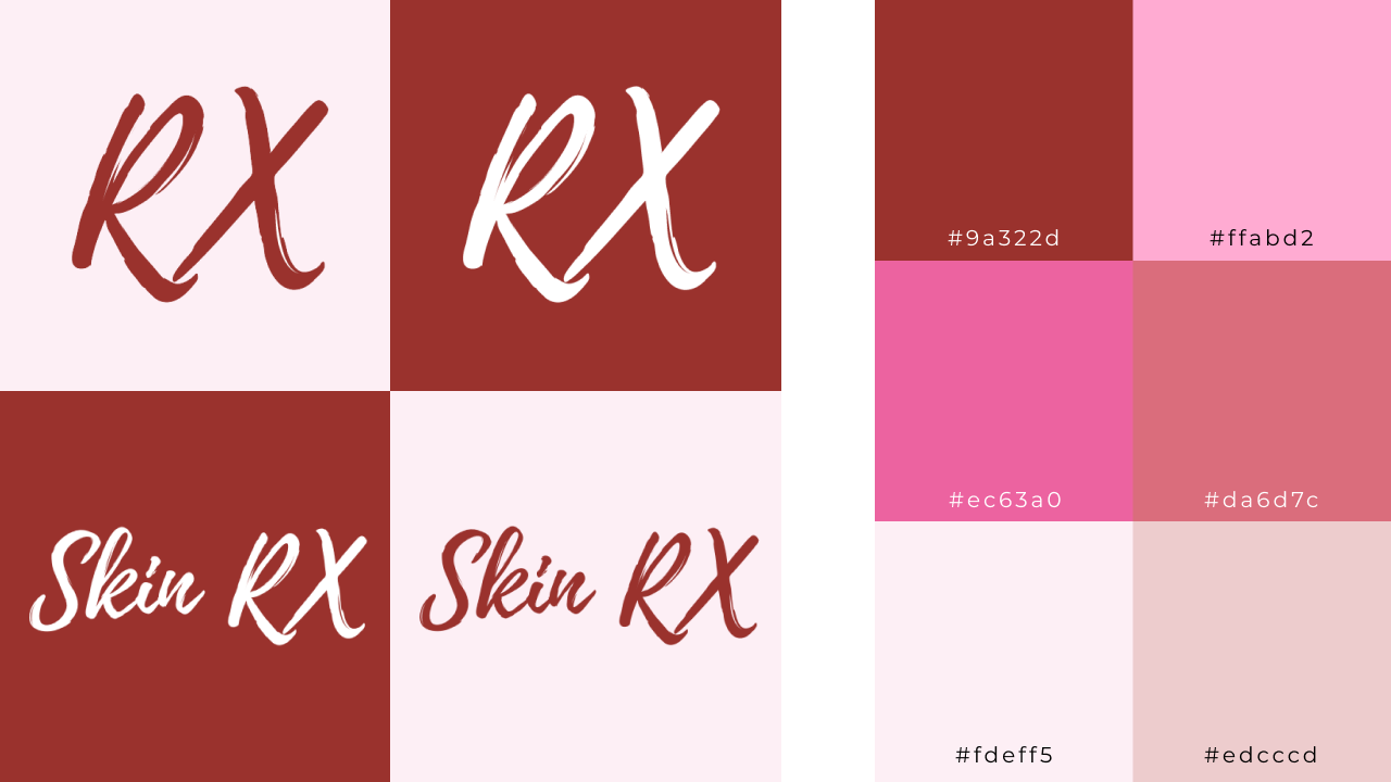
I redesigned SkinRX’s Logo. I omitted the swirly line and ‘Face and Body Wellness’ quote and only used ‘Skin RX’ for the final design. The typography I used is ‘Playlist Script’ and the colour I used is a darker red (#9a322d). For the favicon, I only used ‘RX’.
LO-FI WIREFRAMES
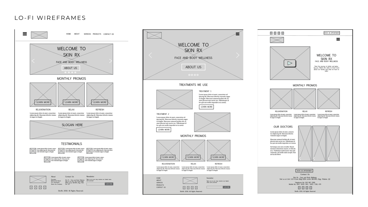
Here are some wireframes ideas for what my Home page layout might look like. We were required by the professor to submit three versions of wireframes for our website.
HI-FI WIREFRAMES
These are the final wireframes I submitted to the professor which were designed on Adobe Illustrator. However, upon finishing, I realized I was missing some content. I forgot to create a Promos page and also forgot to create individual subpages for the Services page. Since I was already on a time crunch, I went ahead and developed the website from scratch. If you visit the live website, it drastically looks different from the final version. That is because I mixed and matched some parts found in all wireframe versions.


DEVELOPMENT
The biggest challenge I faced was developing and coding the website. We were only just introduced to HTML and CSS back then. However, I’ve managed to learn through tutorials. W3Schools, CSS-Tricks, and Tumblr Themes actually helped me. The website is coded in HTML5 and CSS3 with some JavaScript plugins. The website is also fully responsive.
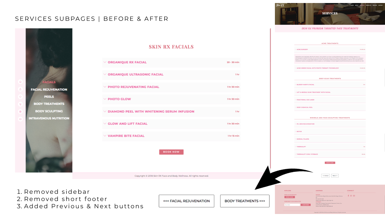
I also did a major revision on the Services subpages after the project since my first version of these subpages actually looks different from the main 6 pages of my website.
SERVICES SUBPAGES REVAMP CONCEPT
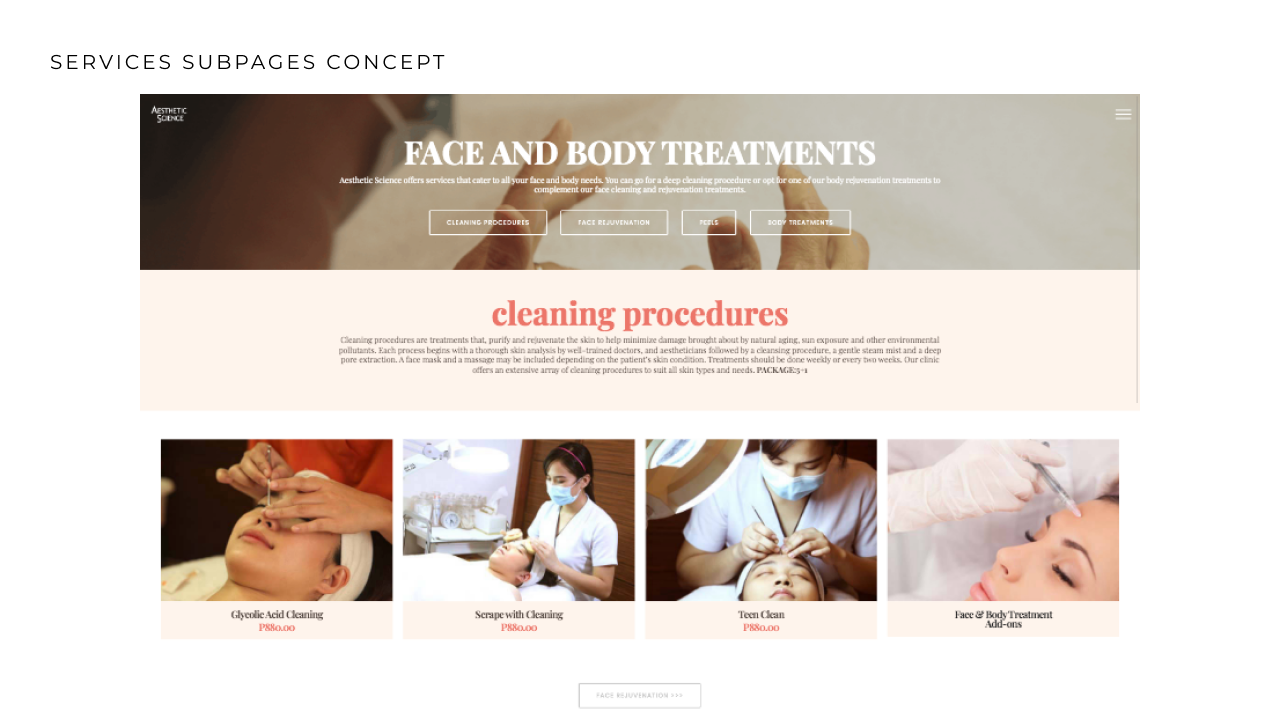
I wanted to recreate this layout from Aesthetic Science. However, I encounter some challenges during the revamp. The major one was trying to add the submenus on the featured header. I had to abandon that idea after realizing that I’m going to encounter responsive web design issues in that area. My next idea was to recreate the sidebar menu that’s usually found on blogs. I wanted to keep the sidebar menu found on my first iteration. However, I also had to abandon that idea because I’m having problems with the JavaScript plugins. The only successful recreation I did was the ‘previous and next’ button pages.
REFLECTION
Be consistent with your branding: I was aiming for a full-page popup look like the one from ‘Aesthetic Science’ but I encountered problems with the code that I ended up creating separate pages for the different types of services and having a different style in those subpages.
