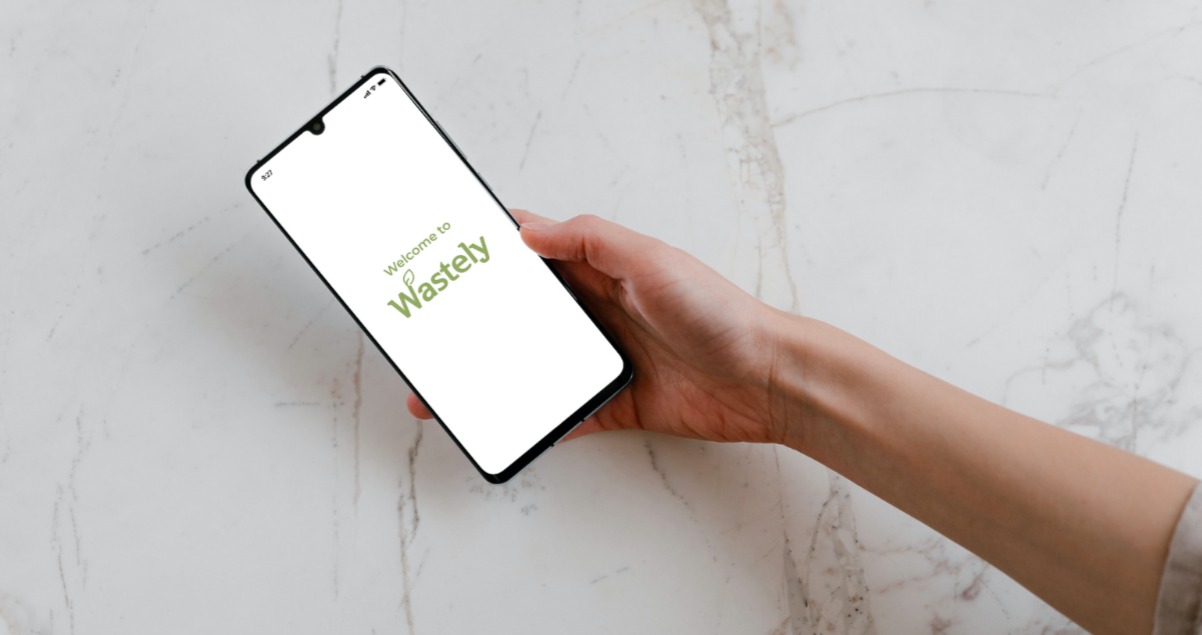
Wastely is a food waste reduction solution that starts in the home and extends to local and global communities. This is the result of a four-day design sprint conducted remotely by a group of designers from around the world who wanted to find a novel solution for reducing food waste. AJ&Smart’s was chosen for the Design Sprint methodology.
MY KEY ROLE
UX Researcher
UX Designer
SUPPORT
UI Designer
UX Copywriter
PRODUCT TYPE
Mobile App Prototype
DURATION
1 Week
15 May 2021 – 19 May 2021
CLIENT
Design Sprint Project by random designers from Design Buddies community
SPRINT TEAM
Christina Maury, Facilitator and Group Organizer
Linh Le, Lead Designer and The Decider
Robert Ruediger, Lead Interviewer and Assumptions Board Manager
Christina Maresca, Lead Recruiter
Janice Jons, Designer and Researcher
Kathrina Tacastacas, Designer and Researcher
ABOUT THE PROJECT
Wastely is the result of a four-day design sprint conducted remotely by a group of designers from around the world who wanted to find a novel solution for reducing food waste. Our team came together when our facilitator, Christina Maury, reached out to the Design Buddies community with an invitation to collaborate on a Design Sprint according to the AJ&Smart Design Sprint methodology. The final team was made up of aspiring designers across the globe. To overcome the geographic barriers, Discord was chosen as our main communication platform because of it’s reliable video-calling services and free forums. To collaborate in real-time on the various stages of the Design Sprint and to create the prototype, both Figma and the new FigJam were utilized for the entire process.
THE PROBLEM
Prior to starting the Design Sprint, democratic voting between the members was used to choose food waste reduction as the problem space to focus on. Issues like natural resource depletion, greenhouse gases, and the growing number of landfills are directly related to the amount of global food waste.
THE SOLUTION
Wastely is a food waste reduction app that makes it easy for users to find thousands of recipes, resources, techniques, and organizations to reduce food waste and reward them for reducing their own waste at home.
THE PROCESS
AJ&Smart’s Design Sprint was chosen for this project because it is the most up-to-date version of Jake Knapp’s process. The biggest difference between the AJ&Smart methodology and the original process described in Knapp’s book is that the new process is only a four-day sprint. By applying this methodology, we were able to define the challenges by interviewing a real food waste reduction expert and educator, produce an MVP after producing a mass of solutions and voting on the best one, and test our solution with real users.
DAY 1 | Define the challenge | Produce a mass of solutions
EXPERT INTERVIEW
On our first day, Christina Maury was able to line up an expert interview with Ms. Alma Nejenhuis, who has founded her own co-op, serves on the board of another, and is a Food Waste and Environmental Studies educator in the Netherlands. We were excited to have an expert with a wealth of knowledge and a fantastic ability to explain complex problems in simple terms.
From our interview we learned that most food waste begins at home and that there are a wide-range of obstacles that make it difficult to overcome this. Ms. Nejenhuis emphasized that a big obstacle is that there isn’t a convenient way for all people to access reliable information about what they can do with food they already have and how they can make smarter choices when buying groceries.
HOW MIGHT WE?
Reflecting on our interview, the team employed the “How might we…?” (HMW) method to determine our long term goals and our sprint questions. Each member of the team wrote down their insights from the interview and then the sticky notes were mapped to create the following categories:
- Creative Cooking and Recipes
- Social Status
- Sharing Information and Ideas
- Shifting Perspectives and Attitudes Towards Food Waste
- Global Accessibility
- Reduce Waste
Finally, dot voting was used to narrow down our questions in order to begin the process of deciding our long-term goals.
LONG-TERM GOALS
With the top-voted HMW questions as a point of reference, each team member imagined what a solution might look like in 2 years, 5 years, and 10 years. We wrote our goals on sticky notes and were allowed to present them for one minute each. Afterwards, Linh Le, our Decider, was allowed to select our final long term goals. These were the three long term goals that she chose:
- Provide a platform where users can share and retrieve helpful ideas regardless of their background and socio-economic status
- Make reliable information about food waste reduction and a community of helpful users accessible and easy to find
SPRINT QUESTIONS
Additionally, we employed the “Can We…?” method to take a pessimistic approach to craft our sprint questions which would be referred to throughout the rest of the sprint. By repeating the process outlined in the HMW section, the following sprint questions were chosen to accompany our long term goals:
- Can we create a product that encourages people from all backgrounds to share creative food waste reduction ideas?
- Can we reward users for sharing their ideas and information?
- Can we ensure that the information is always safe and reliable?
STORY MAPPING
To pinpoint the area where we could make the biggest impact, we used story mapping to determine the high-level steps required to achieve our goal. This was the first time in the sprint where our team was not on the same page which resulted in conflicting ideas about what exactly we should be mapping. Because time was limited, we decided to map the entire process of cooking at home from the planning stages to what happens after a meal.
By using map targeting and looking at where our sprint questions fit into the story map, we found an interesting correlation between our questions and the planning phase of grocery shopping. At this point, it was decided that we would create a product to help users reduce their food waste at home by making smarter decisions about the food they already have and what they plan to buy.
LIGHTNING DEMO
Once we narrowed down the problem space, each member was assigned with task of preparing a Google Slides presentation for a lightning demo of competitor and analogous products that have already explored this problem space. I focused my presentation on apps that helped users find recipes and create shopping lists based on the food they already have in their fridge or pantry. My suggestion was to create a product with a similar purpose but with suggestions that prioritized reducing food waste as much as possible.
Several UI elements presented during the lightning demo, including the color scheme, were eventually included in the final prototype that was used for testing on day four.
CRAZY EIGHTS
As we approached the end of day one, it was time to ideate our first solutions. To begin this, we used a technique called “crazy eights” where each member was tasked with (digitally) drawing doodles of eight potential solutions in eight minutes. We then presented our solutions to the group and discussed our favorites to prepare for ideating the final concept.
THE FINAL CONCEPT
The last activity of day one was for each member to individually create a three-panel storyboard of a final concept in the form of sticky notes. Once we completed our storyboards, they were anonymously posted to a FigJam board to be examined on day two.
DAY 2 | Curate and vote on best solutions | Define the prototype with a storyboard
FINAL CONCEPT DECISION
Picking up where we left off on day one, we began our second day by unveiling everyone’s final concept storyboards for initial impressions. Then we were assigned an unlimited number of “dots” on ideas that were interesting and we were allowed to write any questions we had under each storyboard.
Afterwards, our facilitator conducted speed critiques where she would summarize each storyboard and then try to answer any of the questions related to the concept. One key thing to consider when storyboarding for this process is that the design needs to be able to “speak for itself.” If the design isn’t clear to the facilitator, how will users get it?
To make a final decision, the straw poll method was used. First, each member was allowed a single vote and could explain their rationale by writing a concise reason on a sticky note to accompany the vote. After the votes were revealed, our decider was given time to examine everything one final time before casting the deciding “super vote.”
Linh used her vote on a storyboard titled “The Google of Food Waste Reduction” which was designed by Christina Maresca. The storyboard features an app with a simple home screen that affords users the options to give or receive unwanted food, to chat with other community members, and to learn ways to reduce their food waste. Each of these features were also wireframed on the two remaining slides.
USER TEST FLOW
One issue that was immediately apparent was that our chosen concept was a good collection of features, but it didn’t give us a complete flow for our user tests. When making her decision, Linh suggested incorporating some of the more promising features from other storyboards (including my concept for tailoring recipes to a user’s inventory). This gave us plenty of ideas to work with when designing our user test flow.
The first phase of creating a finalized user test flow was for each member to individually write six action steps. As was done with previous activities, the ideas were presented to the group for voting and in the end the action steps which Bob wrote were chosen to use as the foundation for our user test flow.
STORYBOARDING
Armed with our long-term goals, sprint questions, final concept, and action steps, the rest of day two was dedicated to drawing the storyboard for our prototype. Our initial flow consisted of eight screens starting with an entry point of signing up for the app and the success criteria of users finding a reliable resource on the app for using the food they already have. With the storyboard completed, day two came to a close with a solid idea chosen and the plans for a prototype completed.
DAY 3 | Design and build the prototype | Recruit and schedule user tests
PROTOTYPE
Day three was devoted almost entirely to creating the prototype of our app for our user testing the next day. However, Christina Maresca also led the charge on recruiting the participants for the test and also assisted me in writing a finalized test script. The prototype itself was created using Figma and was worked on by the entire sprint team throughout the day.
At the end of day three, we ran a trial run of the user test to ensure that the prototype was working and that the tasks and script aligned with our long term goals and sprint questions.
DAY 4 | Test the prototype with 5 real users | Use feedback from testing to create clear next steps
PARTICIPANTS
The participants for user testing were recruited on day three from various social media outlets. We specifically targeted participants who were responsible for the grocery shopping and meal planning in their households.
- Aurelia K. – Visual Designer, New Jersey, USA, 35+
- Tugce G. – Research Consultant, London, UK, 31-35
- Kelsey L. – Student, Maryland, USA, 25-30
- Samantha L. – Student, Paris, France, 31-35
- Gabrielle N. – Purchaser, Washington, USA, 25-30
TASKS
After a brief introduction and some simple background questions, participants were presented with the following tasks during the user tests:
- You have extra food that you want to find a use for…try to use the app to input the food you currently have in your fridge/pantry to get suggestions on what to do with it.
- Now that you’ve added your food to the app, find a great meal idea for you to use after you come back from shopping later.
- You want to see what other people are saying about alternative food waste reduction options such as fermentation…where would you go?
FEEDBACK CAPTURE GRID
During each user test, team members kept track of their insights on a voltage control spreadsheet and after the tests concluded, the insights were copied onto sticky notes to create a feedback capture grid on FigJam. A feedback capture grid is made up of four sections—Likes, Criticisms, Questions, and Ideas. After everyone added their individual insights, they were grouped by similarity to garner collective insights.
REFLECTION
Wastely was the result of the combined efforts of an enthusiastic, diverse team of aspiring designers who were willing to embrace the Design Sprint process in an effort to combat a “wicked” problem. The experience of working with a team on a design project was exciting and rewarding in a lot of ways. There were times when we felt stuck but were able to overcome it through strong communication and positive encouragement.
As for Wastely itself, without an experienced UI designer on the team, it was hard to create a polished MVP for user tests but through continual refinement, after each test, its visual elements began to showcase the functions of the app very well. Overall, the product was very well received and the benefit was clear to all of our participants.
CONCLUSION AND FURTHER STEPS
In the end, there were countless positive takeaways from this project. I am thankful to have been included in a fantastic team of designers who I am sure all have very bright futures ahead of them. For now, Wastely is a shelved idea but our team has not dissolved and future steps are already being considered.
At the very beginning of our planning stages, the team consisted of ten designers but we, unfortunately, lost four of our members to unforeseen circumstances. We hope to either bring back some of the original members or recruit other eager designers to join us for our next project. I would also like to try my hand at some of the other roles by either facilitating a Design Sprint myself or acting as “The Decider” in the future.


