Designed an educational content website for NextPay.ph that covers business loans, insurance, employee benefits, etc to help MSMEs understand financial management to further grow their business.
MY KEY ROLE
UX Designer
UI Designer
Interaction Designer
SUPPORT
UX Researcher
UX Copywriter
PRODUCT TYPE
Web Prototype
PROJECT TYPE
2 Weeks
17 Jan 2022 – 29 Jan 2022
CLIENT
Client Project for my UX Design & Research course in UX+ University
PROJECT TEAM
Kate Tacastacas
designer
Patricia Denise Dizon
product manager
Karla Domingo
researcher, designer
Hiraya Lopez
researcher, designer
INTRODUCTION
NextPay is a digital banking platform for MSMEs & entrepreneurs in the Philippines. It enables these stakeholders to send invoices, collect money, manage payroll, pay their bills. NextPay is the best alternative from bank accounts because we manage their finances and remove steep barrier entries that these financial institutions usually require such as large set-up fees and daily average balances.
OBJECTIVE
How might we help MSMEs understand financial management to further grow their business?
The goal of this project is to launch an educational content series that covers business loans, insurance, employee benefits, and more.
FINAL DESIGNS
USER RESEARCH
In order for us to help educate MSMEs understand financial management to grow their business, we had to first get to know the people coming from this sector and understand where they are coming from.
We conducted moderated user interviews via Zoom & Google Meet with 5 business owners/founders & 3 freelancers and uncovered two personas.
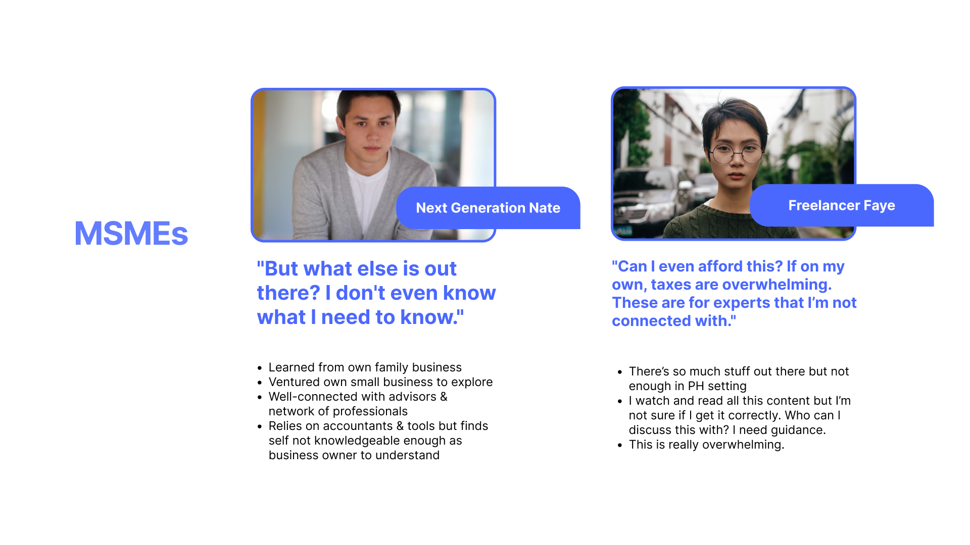
PROBLEM
Majority of the users find it difficult to find business financial content online and they mostly rely on their network, mentors, and online resources.
GOAL


UX AUDIT
We conducted a usability audit of the NextPay blog and analysed the various resource pages of NextPay. We also looked for design inspirations online as references for the project. This process allowed us to identify usability issues and helped us define which solutions to include in our final design.
TAKEAWAYS
After conducting a usability audit and examining various resources sites, we set our goals for the project:
- Make masthead contextual
- Remove Newsletter CTA as Masthead CTA. Make them read and stay in the blog
- Communicate that this educational content website is for PH setting
- After reading the article, CTA to NextPay app must be clear and obvious
- Add content filters
- Add page numbers
- Provide “you might like…” to read other content after 1 article
- Provide metrics to measure the usefulness of the content
- Make the sharing of the content clear and interactive

WIREFRAMES
The wireframes introduced a new educational content website inspired by common patterns found in user research. It includes:
- Home page as the landing page upfront.
- Persona selection page, specific content for the persona are displayed.
- Content page to view content offerings such as articles, videos, and templates.
- Glossary page to view quick business finance terms & definitions.
ITERATIONS
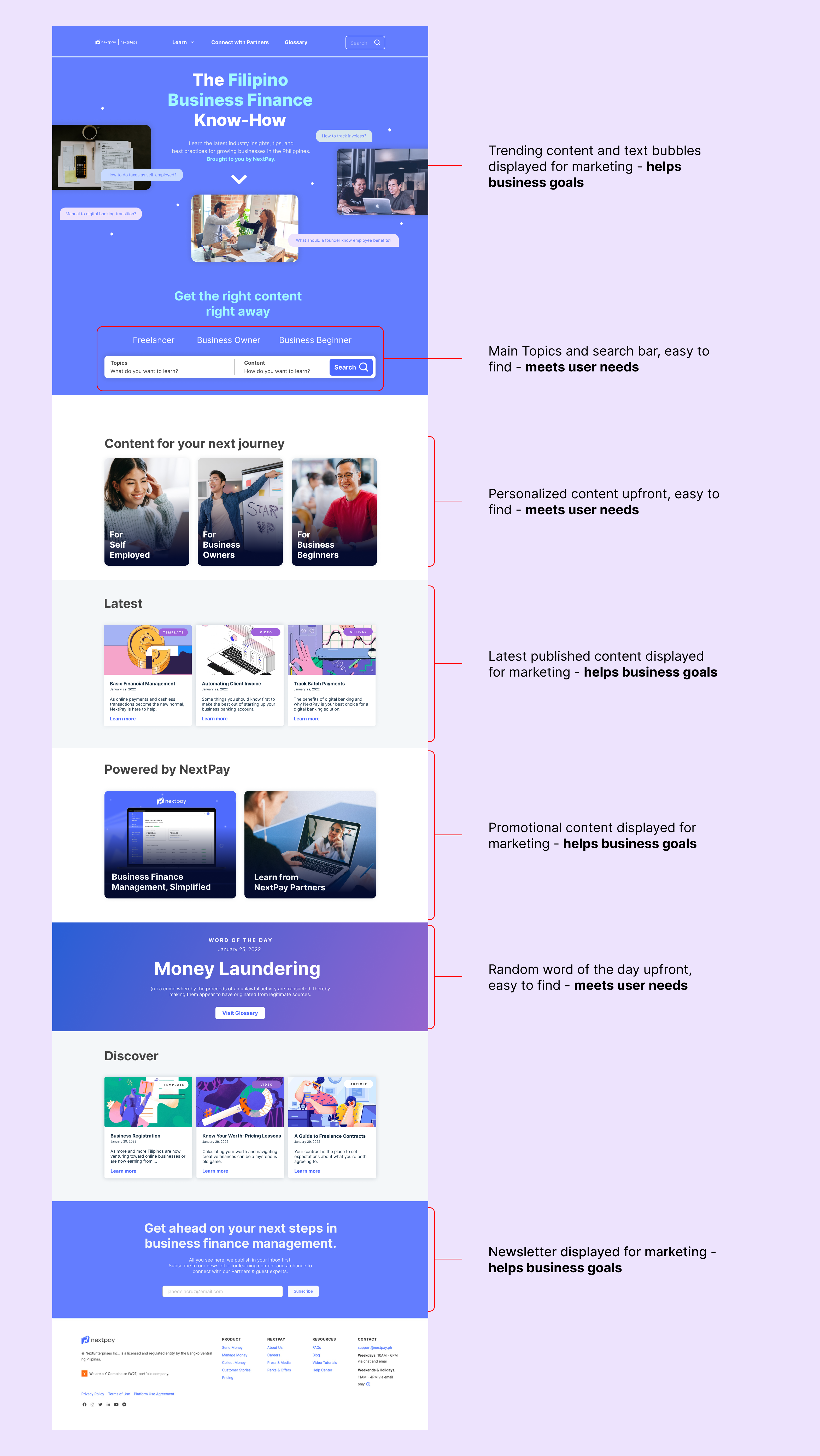
HOME PAGE ITERATIONS

Hero image showcases the content of the website so the user can quickly know what the website has to offer for them to meet business goals. Pros and cons are evaluated from user testings.
Cons: Sacrifice user needs and business goals
- Users did not understand what the start learning button is about or where it leads to.
- Users got overwhelmed with the filter tags and wanted to search for content right away.
- Search bar (in high fidelity design) is not the most commonly used design.
- Users spent a longer time looking for content because they would scroll each row.
- Users did not understand what “NextPay Exclusive” and “Verified by Experts” mean.
- Users did not see the “See More” button.
Pros: Satisfies users needs and business goals
- Users had a higher completion rate (through user testing). If they didn’t find the content, they quickly search for it.
- Replaced the start learning button with a down arrow instead. Users had a higher conversion rate to scroll down and explore the page.
- Personalised content for each persona is higher.
- Added latest published content, promotional content, and random Word of the Day as a moment of delight for users to view.
PERSONA PAGE ITERATIONS

Users will land on this page after clicking Freelance from the home page and navigation bar.
Cons: Sacrifice user needs and business goals
- Users felt bombarded with text and pictures.
- Users got overwhelmed with the filter tags and wanted to search for content right away.
- Search bar (in high fidelity design) is not the most commonly used design.
Pros: Satisfies users needs and business goals
- Users had a higher completion rate (through user testing). If they didn’t find the content, they quickly search for it.
- The action and visual hierarchy reflects the preferences of users and follows common design patterns.
CONTENT PAGE ITERATIONS

Users will land on this page after clicking on any content from the website.
Cons: Sacrifice user needs and business goals
- Selected tags is lower.
- Users liked that the words are clickable but wished there was a pop-up instead of leading to a different tab.
- Users liked that they can rate the article and leave feedback to the creator but thinks it can be further improved in terms of interaction.
- Users liked that they can contact the creator directly if they have further questions. They can learn more about them and book a session with them. It can be further improved by adding more ways to contact the creator aside from scheduling a call.
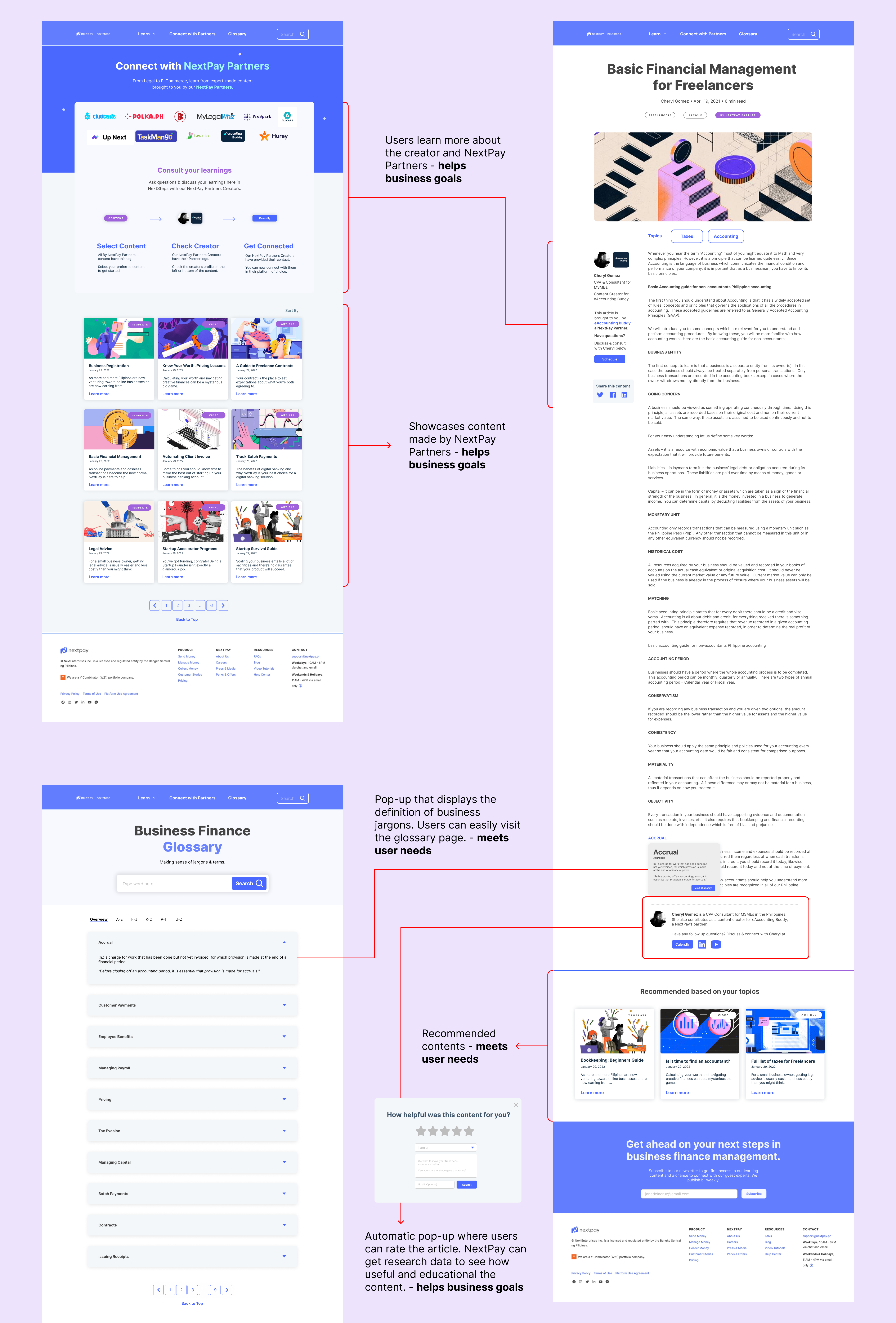
- Recommended content is shown at the bottom for the user to view more similar content offerings.
Pros: Satisfies users needs and business goals
- Selected tags and topics is higher.
- Creator’s profile on the left showcasing that they are a NextPay Partner.
- Clickable word which displays a pop-up to show the definition.
- Automatic pop-up where users can rate the article according to how useful and educational the content is.
GLOSSARY PAGE ITERATIONS

Users will land on this page after clicking on a word from the content page.
Cons: Sacrifice user needs and business goals
- Users did not understand what quick terms mean.
- Users got overwhelmed with the filter tags and wanted to search for business terms right away.
- Users suggested that only the topics discussed on the content page are shown.
- Once they clicked the word from the content page, users suggested that the word automatically opens on the glossary page. Users found the whole process inconvenient and spent a longer time clicking on the website.
Pros: Satisfies users needs and business goals
- Users, especially the newbies, found the overall page helpful and educational in terms of understanding business finance terms.
- Users found the page catering to all users.
- Users want to bookmark this website since they feel this is the most important part of the website for their purposes.
- Users liked the dropdown feature and does not find the page overwhelming with text.
- Users liked the alphabetical filters.
USABILITY TESTING
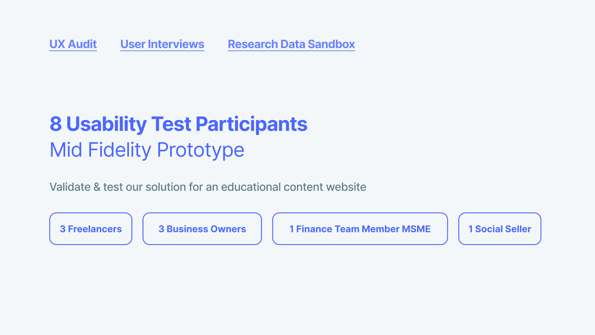
GOALS
Validate and test our solution for an educational content website.
TOOL
Figma
USERS TESTED
8
METRICS
Task Completion Rate
Satisfaction Rate
User Error Rate
TASKS
- Click the “See More” button in landing page
- Select topics that may apply to you
- Click an article that best fit for your needs
- Click a word that you don’t understand
- Rate the article and leave a feedback
- Find the Glossary page that houses business finance jargons and terms
RESULTS
Overall, my design has an average task completion rate of 77% and satisfaction rate of 9/10.
- Users had a positive experience completing the tasks but there can still be room for improvement in terms of the design and interactions.
- Users found the filter topics helpful but thinks it can be designed better. They rather use the search bar. They recommend top topics would show once they start searching.
- Users were expecting a pop-up would show up once they clicked on the word and not direct them to the glossary page.
- Interactions can be further improved to lessen accidental error clicks.
- Overall, users found the website very informative and were excited to see the finished product.
HI-FI MOCKUPS
After each round of user testing, I created iterations on the homepage based on the common issues. The redesigned homepage makes the user want to scroll down and see what the site has to offer to them.
HOME PAGE
SPECIFIC PERSONA FLOW
The redesigned flow of each persona helped users to find specific content that best applies to them and fits their needs. The contents are sorted and displayed in a visually appealing way so that the user can easily find what they need.

PARTNERS, CONTENT, & GLOSSARY PAGE
The redesigned content page helped users to learn more about the creator and what “NextPay Partners” means. The partners page showcases all content made by NextPay Partners. For the business, in return NextPay & its partners gain more visibility and opportunity to reach prospects & understand their pain points. The glossary page houses all the business terms you need to know. The interaction experience was also improved to make it more engaging.
HI-FI PROTOTYPE
REFLECTION
CHALLENGES
Upon receiving the brief from the client, we stalled and did not start right away to conduct research interviews. Though the team managed to finish the project on time, it would be helpful to start user research right away and just validate what we’ve come up along the way.
This was my first time designing user interactions and it was a fun learning experience. Through this project, I managed to understand how users interact with digital products.
NEXT STEPS
With our findings, we see our next steps as
- Refine & test prototype.
- Determine business finance topics to put, diversify and broaden our testers and understand what else needs to be improved.
- Consolidate business feedback along with users feedback.
- Create the next iteration with all findings.
- Explore NextPay Partners & growing network and how we can leverage it.
- Have more open conversations on this to explore growth for our MSMEs, Partners, and for NextPay.